Notebook - ML Pipeline Walkthrough
The notebook ml/notebooks/VNTD_ML.ipynb contains the full Machine Learning pipeline. From raw Suricata logs to a trained and evaluated Isolation Forest model.
This page documents every step in the notebook in detail: what it does, why each decision was made, and what the outputs mean.
Running the Notebook
For environment setup instructions (Python, virtual environment, Jupyter), see ML Environment Setup.
Once the environment is active:
The notebook can be opened in the browser at http://localhost:8888. Run all cells automatically, or one by one individually.
Run in order
Each cell depends on the previous ones. Always run from the top. If you re-run a single cell out of order, the DataFrames may be in an unexpected state.
Large file
attacks.json is large (~300,000 events). Steps 1 and 10 may take 10–30 seconds to process depending on the host hardware.
Overview
The notebook teaches the model what normal traffic looks like using only benign data, then asks it to evaluate all traffic. Anything that deviates significantly from normal is flagged as an anomaly.
flowchart LR
    A[benign.json\n~240 events] --> B[Load + Flatten JSON]
    B --> C[Explore Data]
    C --> D[Encode Text Fields]
    D --> E[Add Derived Features]
    E --> F[Add Time-Window Features]
    F --> G[Select Features]
    G --> H[Scale with StandardScaler]
    H --> I[Train Isolation Forest]
    I --> J[Save Model + Scaler]
    J --> K[Build Evaluation Dataset]
    K --> L[Score + Predict]
    L --> M[Evaluate Results\nCharts + Metrics]
Files Used
| File | Purpose |
|---|---|
data/benign.json |
~240 normal events -> used to train the model |
data/attacks.json |
~300,000 attack events -> used to evaluate the model |
Why Train Only on Benign Data?
attacks.json contains approximately 300,000 events, the vast majority being SYN flood packets from a DoS attack. Training on that data would teach the model that DoS floods are normal. By training exclusively on the 240 benign events, the model learns a the behaviour of legitimate ones. Everything that deviates significantly is then suspicious.
Step 0 - Configure Settings
The first cell defines which Suricata event types to exclude before loading.
alert events are excluded by default because Suricata has already applied a detection rule to them. Including those events would give the model unfair information about known attacks; it would be learning from pre-labelled data rather than discovering patterns on its own.
The other types (anomaly, fileinfo) are commented out and can be included or excluded to experiment with different training inputs.
Step 1 - Load the Data
Suricata writes logs as JSON Lines: one JSON object per line. Each line is parsed and then flattened so that nested dictionaries become simple column names.
Before flattening:
{
  "event_type": "flow",
  "src_port": 38018,
  "flow": { "pkts_toserver": 2, "age": 0, "state": "new" },
  "tcp": { "syn": true, "rst": true }
}
After flattening:
event_type             flow
src_port               38018
flow_pkts_toserver     2
flow_age               0
flow_state             new
tcp_syn                True
tcp_rst                True
Different event types have different fields. A dns event has no flow_* fields; a flow event has no dns_* fields. Columns that don't apply to a given event type become NaN. These are filled with 0 before training.
Step 2 - Explore the Raw Data
Before building anything, the raw data is inspected per event type to understand what differences already exist between benign and attack traffic:
- Flow events - Attack flows show dramatically lower
flow_bytes_toclientvs benign, and much lowerflow_age. The server barely responds because it is being flooded. - HTTP events - Attack traffic generates status codes
405and404(method not allowed, not found), while benign HTTP returns200. - DNS events - Both datasets have roughly equal numbers of queries and answers, so DNS direction alone is not a strong discriminator.
- SSH, SMTP, TLS, anomaly - Their presence or absence is noted but they contain no dominant numeric patterns for this particular dataset.
Numeric fields only
.describe() is called on numeric columns only. Text fields (IPs, hostnames, domain names) are not analysed here because they will either be excluded or encoded in the next step.
Step 3 - Encode Text Fields as Numbers
ML models only understand numbers. Several Suricata fields are text strings and must be mapped to integer codes.
Encoding Maps
| Column | Values -> Codes |
|---|---|
event_type_num |
flow=0, dns=1, http=2, smtp=3, anomaly=4, ssh=5, tls=6, fileinfo=7, netflow=8 |
proto_num |
ICMP=1, TCP=6, UDP=17, IPv6-ICMP=58 |
dns_type_num |
query=0, answer=1 |
flow_state_num |
closed=0, established=1, new=2, syn_sent=3 |
flow_reason_num |
fin=0, rst=1, timeout=2, forced=3 |
dns_rcode_num |
NOERROR=0, NXDOMAIN=1, REFUSED=2, SERVFAIL=3 |
tcp_syn |
Boolean TCP SYN flag -> 0 / 1 |
tcp_fin |
Boolean TCP FIN flag -> 0 / 1 |
tcp_ack |
Boolean TCP ACK flag -> 0 / 1 |
tcp_rst |
Boolean TCP RST flag -> 0 / 1 |
Fields that only exist for certain event types (e.g. flow_state is only on flow events) are encoded partially: rows where the field is absent remain NaN until filled with 0 later.
Step 4a - Derived Features
Three new columns are computed from the existing flow statistics to make common attack patterns more visible as single numbers.
| Feature | Formula | Signal |
|---|---|---|
bytes_per_pkt |
(total bytes) ÷ (total packets) | Low value -> scan traffic (tiny scan packets) |
pkt_ratio |
flow_pkts_toserver ÷ flow_pkts_toclient |
High value -> DoS (server receives but barely replies) |
bytes_ratio |
flow_bytes_toserver ÷ flow_bytes_toclient |
High value -> heavily asymmetric traffic (DoS / scan) |
For non-flow events (DNS, HTTP…), the flow_* columns are NaN and both numerator and denominator become 0, so these derived features are 0 for those rows. Division by zero is prevented by clip(lower=1).
Step 4b - Time-Window Features
The features above evaluate each event in isolation. But many attacks are not anomalous as a single packet but rather anomalous in volume.
- A single SYN packet to port 80 is completely normal.
- 100,000 SYN packets to port 80 in 30 seconds is a DoS flood.
Time-window features count how many similar events occurred close in time.
| Feature | What it counts | Detects |
|---|---|---|
flows_to_dest_port_wndw |
Flows to the same destination IP + port in the window | DoS flood |
unique_srcs_to_dest_wndw |
Unique source IPs targeting the same destination | Distributed scan / DDoS |
flows_from_src_wndw |
Total flows from the same source IP in the window | Port scan / brute force |
unique_dest_ports_from_src_wndw |
Unique destination ports contacted by same source | Port scan pattern |
The time window is 30 seconds. Events are sorted by timestamp, and later grouped and counted.
Why 30 seconds?
A 30-second window is wide enough to capture the pattern of a port scan or DoS burst, but narrow enough to avoid counting completely unrelated traffic. Not too large, not too small.
Step 5 - Visualise Feature Distributions
Before selecting features, the distributions of several key columns are visualised side by side for benign vs attack data.
The charts saved to ml/models/ (see Models) show where the two classes differ clearly. Features with large distribution gaps are the most valuable for the model.
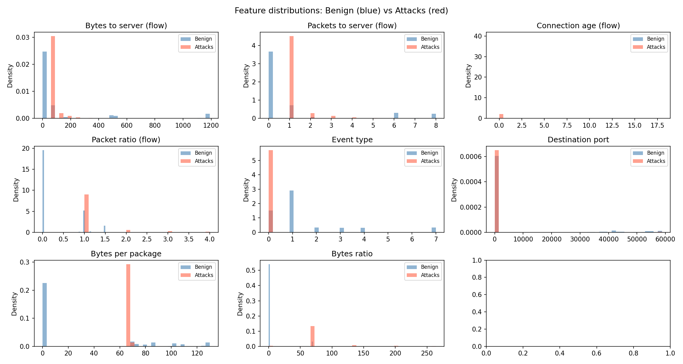
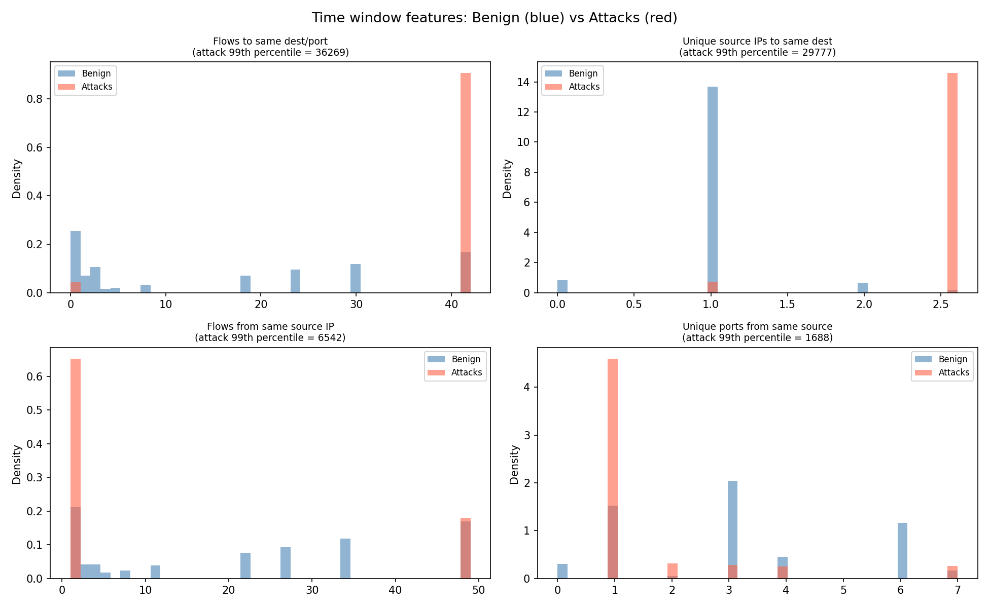
Key observations visible in the charts:
flows_to_dest_port_wndw- attack traffic shows extremely high counts (thousands) vs benign (single digits).flows_from_src_wndw- same pattern from the source side.bytes_per_pkt- attack SYN packets have very low byte counts; benign traffic has a wider range.
Step 6 - Select Features
26 features are selected from all the columns created in the previous steps. The selection covers all major signal types:
FEATURES = [
    # --- all events ---
    "event_type_num",       # type of event: flow=0, dns=1, http=2...
    "proto_num",            # TCP=6, UDP=17, ICMP=1...
    "src_port",             # source port
    "dest_port",            # destination port
    # --- flow events ---
    "flow_state_num",       # connection state
    "flow_reason_num",      # why the flow ended
    "flow_pkts_toserver",   # packets sent to server
    "flow_pkts_toclient",   # packets sent back to client
    "flow_bytes_toserver",  # bytes sent to server
    "flow_bytes_toclient",  # bytes sent back to client
    "flow_age",             # connection duration
    # --- derived from flow ---
    "bytes_per_pkt",        # avg bytes per packet
    "pkt_ratio",            # packet asymmetry
    "bytes_ratio",          # byte asymmetry
    # --- TCP flags ---
    "tcp_syn",              # connection initiation
    "tcp_fin",              # clean close
    "tcp_ack",              # acknowledgement
    "tcp_rst",              # forced rejection
    # --- HTTP events ---
    "http_status",          # 200, 404, 500...
    "http_length",          # response body size
    # --- DNS events ---
    "dns_type_num",         # 0 = query, 1 = answer
    "dns_rcode_num",        # response code
    # --- time window features ---
    "flows_to_dest_port_wndw",
    "unique_srcs_to_dest_wndw",
    "flows_from_src_wndw",
    "unique_dest_ports_from_src_wndw",
]
Any feature column that does not exist in a given DataFrame (because no events of that type were present) is created as NaN and later filled with 0.
Why Ports and Not IP Addresses?
IP addresses are explicitly excluded from the feature list. In an Isolation Forest, all features are treated as numeric magnitudes. IP addresses like 192.168.10.10 and 10.0.0.2 carry no meaningful numeric relationship. A high IP number does not mean a more dangerous connection. Using raw IP values would force the model to weight them by their numeric values, producing unclear results.
Ports are different. They carry real information: port 22 is SSH, port 80 is HTTP, port 53 is DNS. Concentrated traffic to a single port signals a targeted attack. Traffic scattered across thousands of ports signals a port scan. These are exactly the patterns an Isolation Forest can exploit.
IP addresses are therefore deliberately excluded from the feature set.
Step 7 - Scale the Features
Before training, all features are normalised using StandardScaler.
Features have very different value ranges. flow_bytes_toserver can reach thousands; tcp_syn is always 0 or 1. Without scaling, the model would only consider large-magnitude features and would ignore low-range ones.
StandardScaler transforms each feature to have mean = 0 and standard deviation = 1.
Fit only on benign data
fit_transform() is called only on the benign training data. This ensures that the scaling statistics (mean, std) are learned from normal traffic. The attack data and all future real-time events are transformed with scaler.transform() using those same benign statistics.
If fit_transform() was called on an attack or combined dataset, the scaler would be distorted by the attack traffic. The model would then not know what "normal" looks like.
Step 8 - Train the Isolation Forest Model
The Isolation Forest is trained exclusively on the scaled benign features.
model = IsolationForest(
    n_estimators=12000,
    max_samples="auto",
    max_features=0.6,
    contamination=0.12,
    random_state=42,
    n_jobs=-1
)
model.fit(benign_features_scaled)
Parameter Rationale
| Parameter | Value | Why |
|---|---|---|
n_estimators |
12,000 | High tree count -> more stable, consistent anomaly scores |
max_samples |
auto |
Each tree uses min(256, n_samples), standard default |
max_features |
0.6 | 60% of features per tree -> adds diversity between trees |
contamination |
0.12 | ~12% of training events assumed to be slightly unusual |
random_state |
42 | Ensures reproducibility across training runs |
n_jobs |
-1 | All CPU cores used -> faster training |
The contamination parameter directly controls where the decision threshold (offset_) is placed. A value of 0.12 means the model believes up to 12% of the training data to be abnormal and will set the threshold such that approximately that proportion is flagged.
After training, the decision threshold is printed:
Decision threshold (offset_): -0.5614
-> Any event with score BELOW this threshold is flagged as an anomaly
Step 9 - Save the Model
Both the scaler and the model are stored on the device using joblib so that the real-time detector can load them without retraining from scratch.
joblib.dump(scaler, "../models/scaler.pkl")
joblib.dump(model,  "../models/isolation_forest.pkl")

with open("../models/model_threshold.txt", "w") as f:
    f.write(str(model.offset_))
Three files are saved:
| File | Contents |
|---|---|
scaler.pkl |
Fitted StandardScaler object |
isolation_forest.pkl |
Trained Isolation Forest object |
model_threshold.txt |
Numeric threshold value as a plain text float |
Step 10 - Build the Evaluation Dataset
To evaluate the model, a labelled dataset is needed: including known benign events (label 0) and known attack events (label 1).
The two DataFrames already loaded in Step 1 are reused. A _label column is added to each and they are concatenated:
df_benign["_label"] = 0
df_attack["_label"] = 1
df_all = pd.concat([df_benign, df_attack], ignore_index=True)
The same 26 features are extracted, missing values are filled with 0, and scaler.transform() (not fit_transform) is called to scale using the benign training statistics.
Step 11 - Predictions
The trained model is asked to classify every event in the evaluation dataset.
Two outputs are produced:
predict()- binary decision per event:1(normal) or-1(anomaly).score_samples()- a continuous anomaly score; more negative = more suspicious.
Step 12a - Score Distribution Diagnostic
Before looking at accuracy metrics, a visual check is made to confirm the model has learned meaningful separation.
The anomaly scores for benign events and attack events are plotted as histograms. The decision threshold appears as a dashed vertical line.
What to look for:
- Attack scores should cluster to the left (more negative) of the benign scores.
- A visible gap between the two distributions indicates strong separation.
- Heavy overlap means the model will struggle to distinguish the two classes.
The chart is saved to ml/models/score_distribution.png.
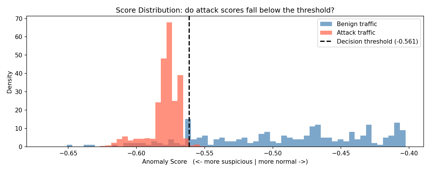
With the current model the benign mean score is approximately -0.491 and the attack mean is approximately -0.579, with the threshold at -0.561. The distributions partially overlap at the boundary, which explains the false positive and false negative rates seen in the following confusion matrix.
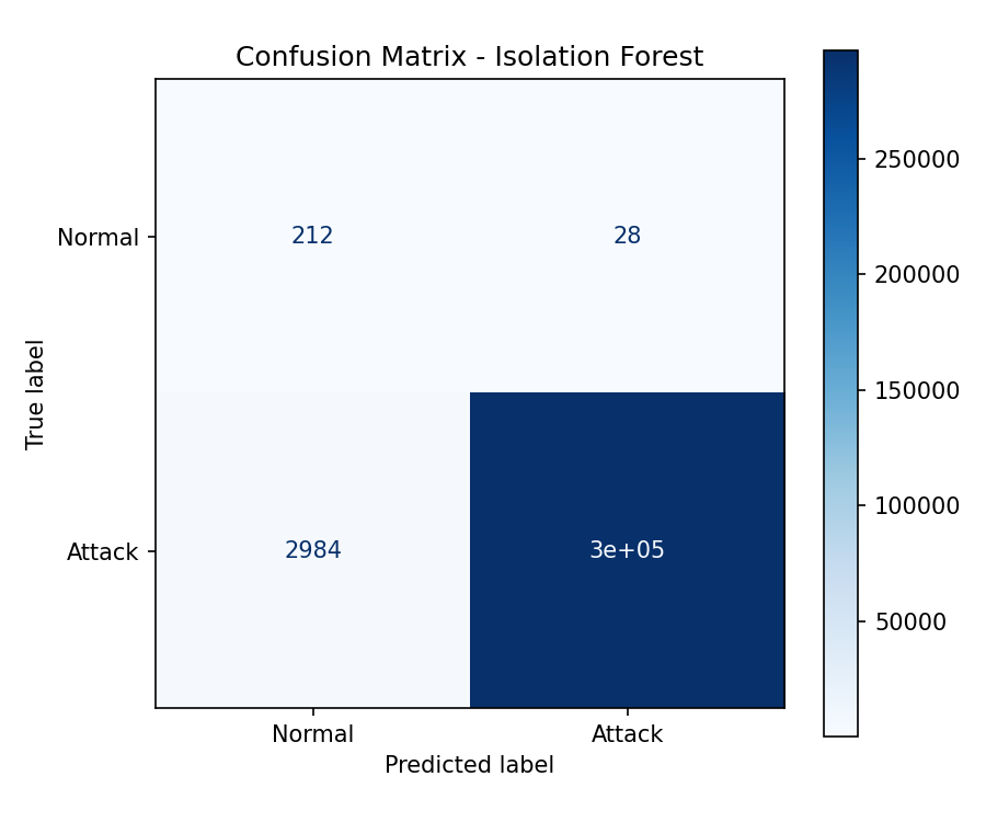
Step 12b - Classification Report
This step prints a standard classification report summarising the models performance using the current decision threshold.
What the Metrics Mean: - Precision - Of all events flagged as attacks, how many were actually attacks. - Recall - Of all real attacks, how many were correctly detected. - F1-score - A balance between precision and recall.
Result Interpretation
- The model detects almost all attacks (high recall:
0.99) - When it flags an attack, it is almost always correct (precision:
1.00) - However, many benign events are incorrectly flagged as attacks, this is why Normal precision is low (
0.07)
The model is biased toward detecting attacks, even at the cost of false positives. It prioritise catching malicious activity over being conservative.
Well trained model, or too much of the same?
The very high performance on attack detection should be interpreted carefully.
The evaluation dataset is heavily dominated by an attack pattern (DoS flood traffic). Out of ~300,000 events, the vast majority follow the same behaviour: repeated SYN packets targeting the same destination.
This makes the task easier for the model:
- The attack pattern is extremely consistent.
- The volume-based features (time-window counts) become very strong signals.
- Even simple thresholds can separate normal vs attack traffic effectively.
As a result, the model appears highly precise and accurate in this specific scenario.
However, this does not necessarily mean the model generalises well:
- Different types of attacks (e.g. low-and-slow scans, data exfiltration)
- More balanced or realistic traffic distributions
- Environments where attack patterns are less uniform
In short:
The model is effective for this dataset, but its performance is partially driven by the repetitive nature of the attacks, not just its ability to detect all possible anomalies.
Step 13 - Model Evaluation
Standard classification metrics are computed using scikit-learn.
Confusion Matrix
The confusion matrix is saved to ml/models/confussion_matrix.png.
Metrics
| Metric | Description |
|---|---|
| Precision | Of all events flagged as anomalies, how many were attacks |
| Recall | Of all attack events, how many were correctly flagged |
| F1-score | Harmonic mean of precision and recall |
| Accuracy | Overall fraction of correctly classified events |
Step 14 - ROC Curve
The ROC curve plots the True Positive Rate (recall) against the False Positive Rate across all possible thresholds. The AUC (Area Under the Curve) provides a summary score independent of any particular threshold: 1.0 means perfect separation, 0.5 means no better than random.
Saved to ml/models/roc_curve.png.
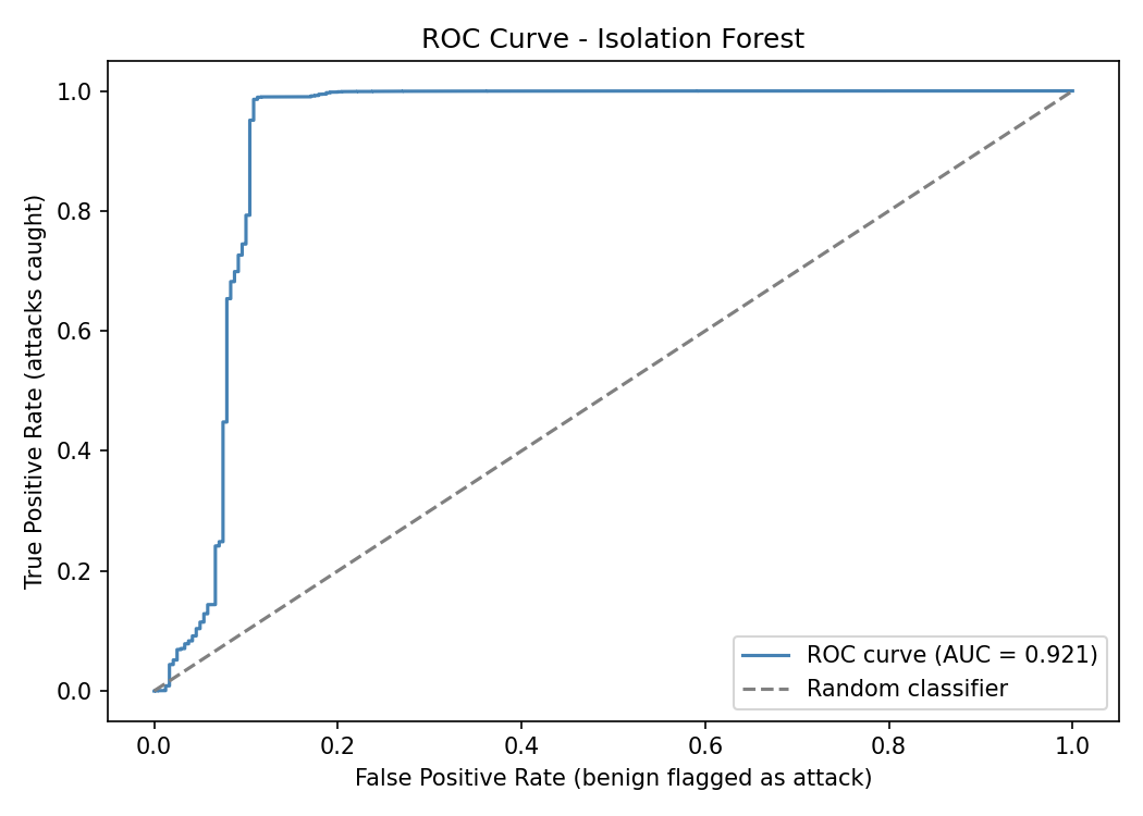
With the current model the AUC is very high, which reflects the same conclusion from the classification report: the attack traffic is heavily dominated by a single, consistent DoS pattern that is easy to separate from benign traffic.